White seems too bright.
Black is too bland.
I get your frustration, which is why I made this guide. This will give you pre-defined industry standards + ways you can come up with your own create colors.
Quick answer: Light neutrals like off-white (#FAFAFA) work best for most websites, but there's SO much more to explore!
Let's dive in!
Quick Tip: Your background color isn't just a design choice – it's the foundation of your entire user experience!
The Psychology Behind Perfect Backgrounds
Before diving into specific colors, let's talk psychology!
To choose the best background color for your website you need to understand the following: colors trigger emotional responses that can influence how users feel about your website...
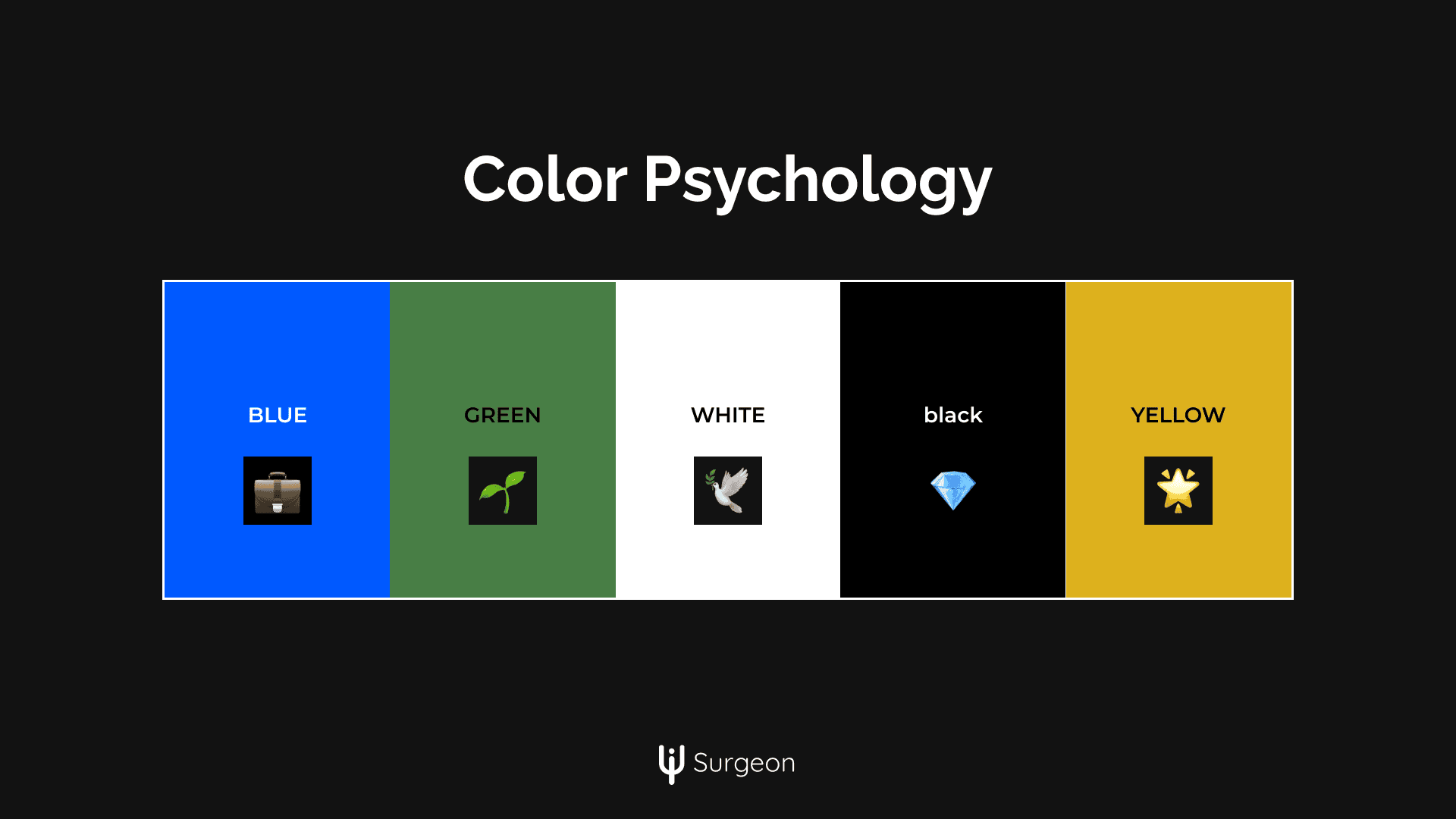
- Blue: Builds trust and conveys professionalism (perfect for business websites).
- Green: Promotes growth, health, and relaxation (great for wellness and eco-focused sites).
- White: Creates space and simplicity (ideal for portfolios or minimalist designs).
- Black: Signals luxury and sophistication (perfect for premium brands and high-end e-commerce).
- Yellow: Represents energy and positivity but should be used sparingly as a background to avoid overwhelming users.
- Red: Evokes passion and excitement, often used as an accent rather than a dominant background.
Understanding these basics will help you align your color choices with your brand's goals and your audience's expectations.
Light Backgrounds🌟
Why Light Backgrounds Work Light backgrounds have been the go-to choice for years, and for good reason:
- Boost Readability: Light backgrounds provide the best contrast for dark text, making content easier to read website content.
- Reduce Eye Strain: Soft neutrals are gentle on the eyes, especially for long-form content.
- Make Content Pop: Images, buttons, and other elements stand out against a subtle, clean background.
Top Light Background Colors
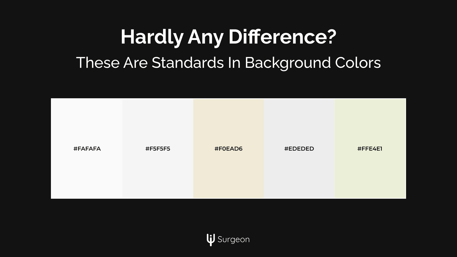
- Off-white (#FAFAFA)
- Pearl (#F5F5F5)
- Eggshell (#F0EAD6)
- Cool gray (#EDEDED)
Bro Tip: Always test your light background against different types of content. Text, images, and UI elements may require different contrast levels for optimal visibility.
Implementation:
:root {
  --light-bg-primary: #F8F9FA;
  --light-bg-secondary: #F5F6F8;
  --light-bg-accent: #F9F7F7;
}

/* Pro tip: Use CSS variables for easy theme switching */
body {
  background-color: var(--light-bg-primary);
  transition: background-color 0.3s ease;
}
Dark Mode Colors🌑
Dark mode isn't just trendy anymore. Apparently you need dark and light mode switches these days. But pure black (#000000) can feel too stark or harsh. Here’s how to master dark mode:
Why Dark Backgrounds Work
- Reduces Eye Strain: Especially at night or in low-light conditions.
- Creates a Premium Feel: Perfect for luxury brands or portfolios.
- Enhances Colors: Vibrant hues and images pop against darker tones.
- Improves OLED Battery Life: Solid dark colors use less energy on modern screens.
Top Dark Background Colors
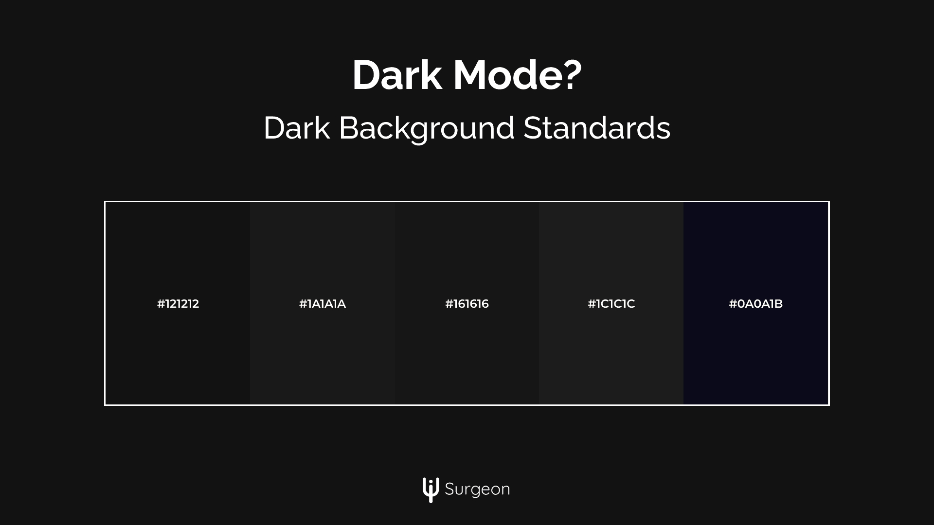
- Rich gray (#1A1A1A)
- Navy black (#0A0A1B)
- Warm dark (#1C1C1C)
- Digital Noir (#121212) - Google's favorite
- Midnight Comfort (#1F1F1F)
- Space Gray (#161616)
Implementation Tip: Use subtle gradients or textures in your dark backgrounds to add visual interest without losing the minimalist vibe.
Subtle Colorful Alternatives For Backgrounds
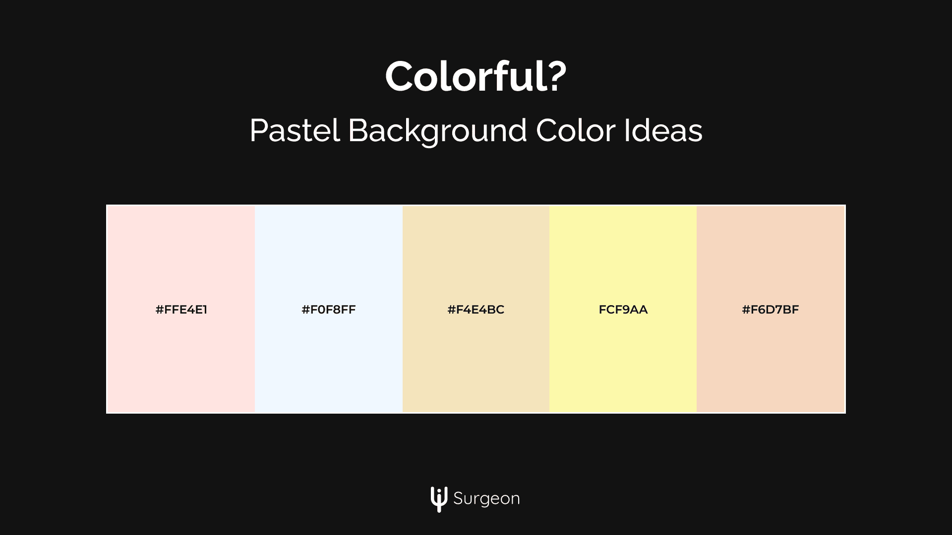
Sometimes, light and dark aren’t enough. Inject personality into your site with bold, colorful backgrounds.
Trending Background Colors in 2025
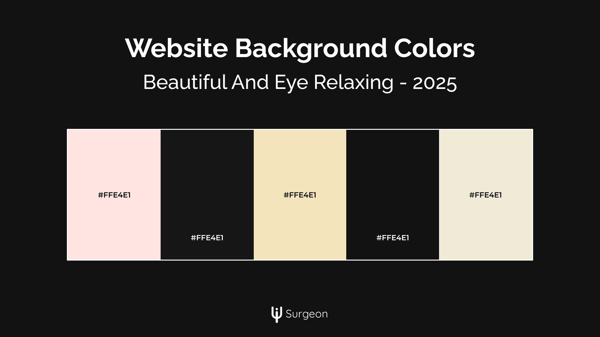
- Pale blush (#FFE4E1)
- Ocean mist (#F0F8FF)
- Desert sand (#F4E4BC)
When to Use Colorful Backgrounds
- Creative portfolios
- Fashion and beauty websites
- Food blogs
- Travel platforms
- Entertainment sites
Color Combination Framework
To create harmonious designs, use these color relationships:
- Monochromatic: Stick to different shades of the same color for a consistent look.
- Complementary: Use colors opposite each other on the color wheel for contrast.
- Analogous: Combine colors adjacent to each other for a natural, blended feel.
- Triadic: Select three evenly spaced colors for a balanced yet dynamic palette.
Technical Implementation Guide 💻
Your background design isn’t complete until it performs flawlessly across devices. Here’s how to make it work:
CSS Best Practices
/* Base styles for all users */
.background-system {
  background-color: var(--light-bg);
  color: var(--text-primary);
}

/* Dark mode preferences */
@media (prefers-color-scheme: dark) {
  .background-system {
    background-color: var(--dark-bg);
    color: var(--text-light);
  }
}

/* High contrast mode */
@media (prefers-contrast: high) {
  .background-system {
    background-color: white;
    color: black;
  }
}
/* Responsive Adjustments */
@media (max-width: 768px) {
  body {
    background: solid #FAFAFA;
  }
}
Optimization Tips
- Use solid colors for faster loading times on mobile.
- Minimize file sizes for background patterns or images.
- Optimize gradient transitions to avoid banding issues.
Accessibility Guidelines
Ensuring everyone can interact with your site is non-negotiable:
- Contrast Ratios: Maintain a minimum of 4.5:1 for text-to-background contrast.
- Test with Screen Readers: Verify that your design works with accessibility tools.
- Support High-Contrast Mode: Some users rely on this for better visibility.
- Enable Easy Switching: Allow users to toggle between light and dark modes.
Common Mistakes to Avoid
Really this is a list for myself I do this quite a lot:
- Using Pure White or Black: Too harsh on the eyes and can feel outdated.
- Ignoring Mobile Users: Backgrounds that look great on desktop might not translate well to smaller screens.
- Skipping Dark Mode: Users expect it in 2025, don’t disappoint them.
- Overcomplicating Patterns: Simple is often better.
- Forgetting Contrast: Low-contrast designs frustrate users and fail accessibility checks.
2025 Color Trends to Watch
Stay ahead of the curve with these emerging trends:
- Eco-friendly greens
- Digital lavende
- Cyber yellow
- Neutral gradients
- Earthy tones
- Retro pastels
Identify Any Color On Any Website
I use ColorZilla which is a chrome extension to get any color I like easily, just download it, pin it to your extensions bar, click it, and select any color you want.
Tools You'll Probably Need 🛠️
Maximize your design efficiency with these essential tools:
- Coolors.co: For generating color palettes.
- WebAIM Contrast Checker: To ensure readability.
- ColorZilla: For quick color picking.
- Adobe Color: To explore advanced schemes.
- HueMint: To experiment with combinations with real-life examples.
Frequently Asked Questions
Which color is best for a website background?
Light neutrals like off-white (#FAFAFA) are generally best for website backgrounds as they provide optimal readability and reduce eye strain. However, the best choice depends on your brand and purpose – business sites often benefit from professional whites and light grays, while creative portfolios might use subtle colors for personality.
What is the 3 color rule for websites?
The 3 color rule suggests using three distinct colors in your website design: a dominant neutral background color (like #F8F9FA), a primary brand color for main elements, and an accent color for calls-to-action. This creates visual hierarchy while maintaining a clean, professional appearance.
Is a light or dark background better for a website?
Light backgrounds typically offer better readability for long-form content and reduce eye strain during daytime use. However, modern websites should offer both options, light mode for general use and dark mode (like #121212) for night reading and OLED devices. The key is providing both choices while maintaining strong contrast ratios.
What is the best background color for reading websites?
Soft neutral colors like pearl (#F5F5F5) or eggshell (#F0EAD6) are ideal for reading-focused websites. These colors provide enough contrast for text readability while being gentler on the eyes than pure white. They also work well across different screen types and lighting conditions.
What is the best dark background color for a website?
The optimal dark background color is soft black (#121212) – the same shade used by Google in their dark mode designs. This color reduces eye strain compared to pure black (#000000) while maintaining the premium feel of dark mode. For variety, rich gray (#1A1A1A) and space gray (#161616) are excellent alternatives.
What colors should I avoid for accessibility?
Avoid pure white (#FFFFFF) or black (#000000) backgrounds as they can cause eye strain. Also avoid low-contrast color combinations or bright, neon colors as backgrounds. Instead, use colors that maintain a minimum contrast ratio of 4.5:1 with your text to ensure readability for all users, including those with visual impairments.
The Bottom Line
Your background color is the canvas for your digital masterpiece. Choose wisely, test thoroughly, and don’t be afraid to experiment!
Quick guideline:
- Define Your Brand's Mood - Define the emotions you want visitors to feel
- Choose Your Base Color - Select a background color that aligns with your brand identity and content focus (e.g., light neutrals for readability or dark tones for a premium feel).
- Test Combinations - Experiment with accent colors, typography, and images to ensure harmony and contrast. Tools like Coolors.co or HueMint can help.
- Optimize for All Devices
- Validate Accessibility - Check for sufficient contrast.
- Implement Responsively - Use CSS variables to create reusable designs that adapt to user preferences (like dark mode).
Remember: Your website background color isn't just about aesthetics – it's about making users feel good and not strain their eyes because of a color you thought was good for a background.. Please take user's eyes into consideration and stay light with your choices.
That's it!

