As a blogger, you feel you need to personalize your blog and make it "you" as much as possible. While great, there are a couple of areas where you should NEVER try to be creative. And the main area your creativity shouldn't touch: is fonts.
Why? Because the right font choices are about clarity, readability, and professionalism, not showing off your artistic side. In this guide, I’ll show you:
- What fonts the experts swear by
- Standards for blog post font sizes
- How To Pair Fonts Like a Pro
- How To Optimize Fonts for Different Devices
Let’s get started.
Why Fonts Matter (More Than You Think)
Fonts aren’t just decoration, they shape your reader's experience. A clean, readable font can:
- Hold attention longer.
- Boost your blog’s credibility.
- Make your content memorable.
On the flip side, hard-to-read or overly “fancy” fonts scream unprofessional, making readers leave faster than they arrived.
The Best Font Families For Blog Posts

As much as we would like to be creative and innovative, fonts should be made for users, not you.
The fonts we choose should be easy to read and clear.
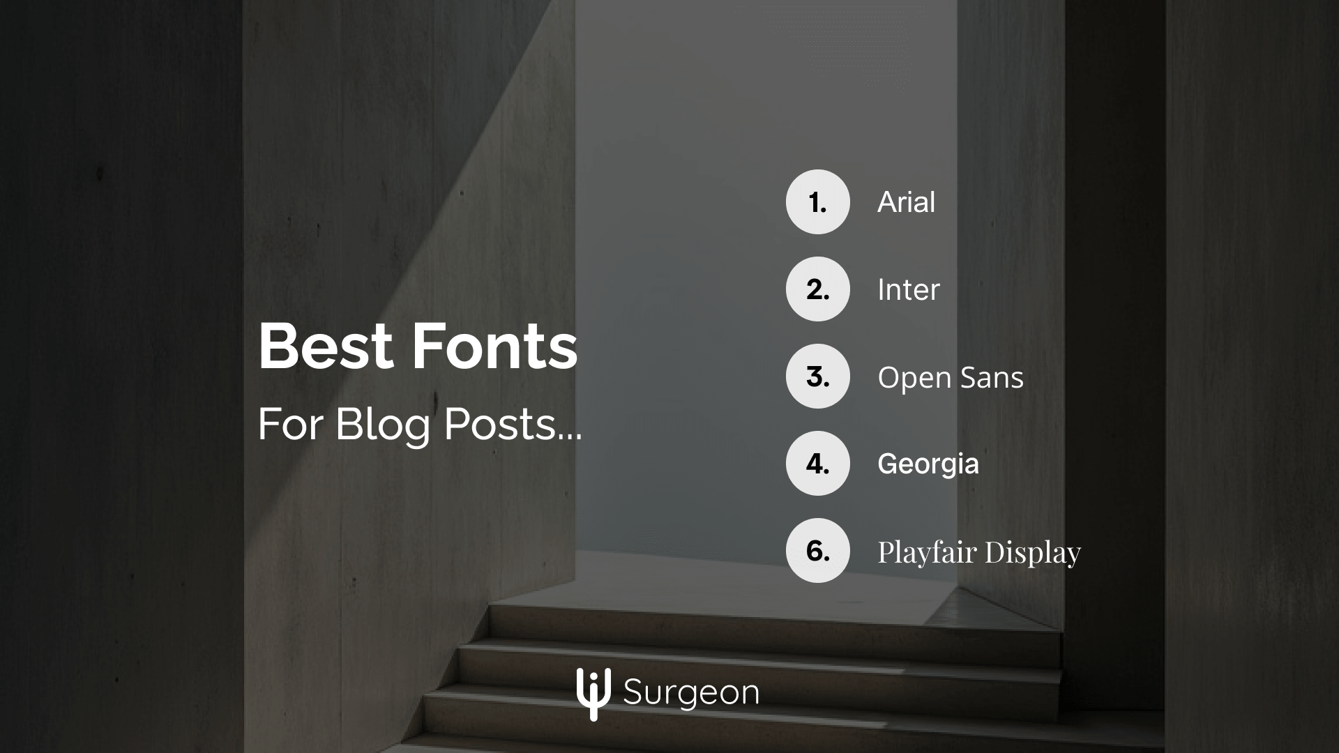
These fonts are universally loved for their clean and professional look:
Sans-Serif Fonts (Modern and Clean)
- Arial
- Inter
- Roboto
- Open Sans
- Poppins
- Lato
- Helvetica
Use Sans-Serif fonts for more modern websites like design, tech, fashion, or how-to guides.
Serif Fonts (Classic)
- Georgia
- Merriweather
- Playfair Display
- Times New Roman
Use Serif fonts for more traditional and classic websites like news websites, or even lifestyle website where you want to be more creative.
You shouldn't use other creative fonts for your blog; these are the standards you should follow. However, there are countless other options that look similar to these. Feel free to choose from them only if they match this criterion: clarity and readability. If your "creative" font goes against these, don't use it.
Best Font Sizes For Blogs

When reading a blog post, there are two main things users (unknowingly) look for: hierarchy and emphasis. So when choosing your font sizes you should consider how different are your fonts from each other. There should be considerable difference in size and boldness for easy scanning.
You should definitely read this guide: 10 Minutes + 1 Concept = Beautiful Designs
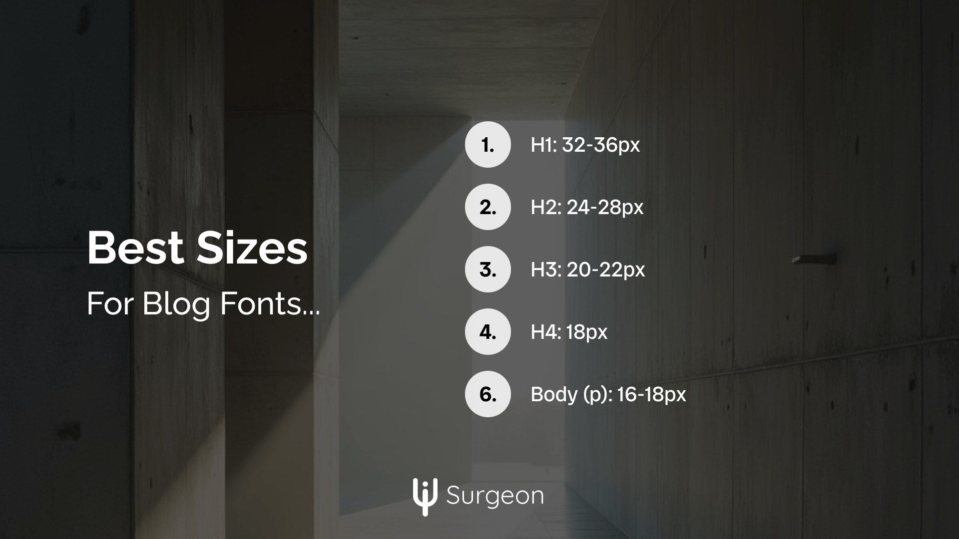
Here are the standards in blog font sizes:
Element | Size | Line Height | Style & Weight | Usage |
H1 | 32-36px | 1.1-1.2 | Bold (700) | Main title, only one per post |
H2 | 24-28px | 1.2-1.3 | Bold (700) | Major section headings |
H3 | 20-22px | 1.3-1.4 | Semi-bold (600) | Subsection headings |
H4 | 18px | 1.4-1.5 | Semi-bold (600) | Minor section breaks |
Body (p) | 16-18px | 1.5-1.7 | Regular (400) | Main content text |
Small/Footer | 14px | 1.5-1.6 | Regular (400) | Less important information |
Blockquotes | 18px | 1.5-1.7 | Italic, Regular (400) | Highlighted quotes |
Lists | 16-18px | 1.6-1.8 | Regular (400) | Same as body text |
Meta Info | 14px | 1.5-1.6 | Regular (400) | Date, author, categories |
Does that mean you should only use these? Mostly yes, but you can still find great blogs using different sizes and weights. As long as you keep all fonts readable, and maintain a level of hierarchy, you can change these standards to fit your brand!
How to Pair Fonts Like a Pro

Listen, pairing fonts isn't rocket science, but there's a reason why some blogs look professional while others not so much. Here's a quick look over font pairing:
The One-Serif-One-Sans Rule This is your golden ticket to clean, professional design. Pick one serif and one sans-serif font for your entire blog. That's it! Don't overcomplicate it.
For example: Roboto (sans-serif) for headings Georgia (serif) for body text
Or flip it around: Playfair Display (serif) for headings Inter (sans-serif) for body text
Just know that this is to spice things up a bit. You can definitely use two sans-serif fonts or two serif fonts, just make the headings a different font family from the body text.
Optimizing Fonts for Different Devices
Here's something most bloggers don't think about: your fonts need to work everywhere, not just on your 27-inch monitor.
Mobile Matters Most: Most of your readers are probably on their phones right now. That means:
- Your body text should never go below 16px on mobile.
- Your headings should scale down automatically.
- Line height should be slightly larger on mobile
Here's how to make your fonts responsive with just a few lines of CSS (Adjust to your brand):
/* Your main font sizes for desktop */
h1 { font-size: 36px; line-height: 1.1; }
h2 { font-size: 28px; line-height: 1.2; }
p { font-size: 18px; line-height: 1.6; }

/* Make everything mobile-friendly */
@media (max-width: 768px) {
  h1 { font-size: 40px; }
  h2 { font-size: 32px; }
  p { font-size: 16px; line-height: 1.7; }
}
Pinterest-Perfect Fonts: Since you're likely getting traffic from Pinterest, make sure your fonts look great in your Pins too. Use the same fonts from your blog in your Pinterest graphics; it builds brand recognition and looks super professional.
Common Blog Font Mistakes to Avoid
I know, sometimes mistakes can be creative and add a touch of "you" to your blog. But just don't overdo these mistakes:
The "Too Many Fonts" Trap: You know those blogs that look like a ransom note? Yeah, that's what happens when you use more than 2-3 fonts. Keep it simple: two fonts maximum for your main content.
The "Fancy Font" Mistake: That decorative font looks amazing in your Pinterest graphics. But for your actual blog content? Save the fancy stuff for graphics and logos only.
The "Same Size" Problem: When your H2 looks exactly like your H3, which looks suspiciously like your body text... that's a problem. Your readers need clear visual hierarchy to scan your content easily.
The Bottom Line
Listen, I get it - when you're starting a blog, you want it to stand out. But truth is: your fonts shouldn't be the star of the show, your content should be.
Just remember that fonts are not the element to play around with or use to show your creativity. While some branding is nice and makes your website unique, if that branding comes at the price of readability or hierarchy, you need to rethink your approach. Your branding should never compromise readability or visual hierarchy - these are non-negotiable elements of good design.
Here's what I want you to do right now:
- Pick two fonts maximum (one serif, one sans-serif for variability)
- Set up your sizes using the code above
- Test everything on mobile (seriously, do this right now)
Remember: Good typography isn't about being creative - it's about being invisible. When your fonts are doing their job right, your readers won't even notice them. They'll just keep scrolling, keep reading, and keep coming back for more.
And isn't that exactly what we want?
You know what else you shouldn't play with? Your website's background colors! Learn about the best background colors to use for your blog now.
And as always, thanks for reading, and let me know if you found this helpful...
That's it!


