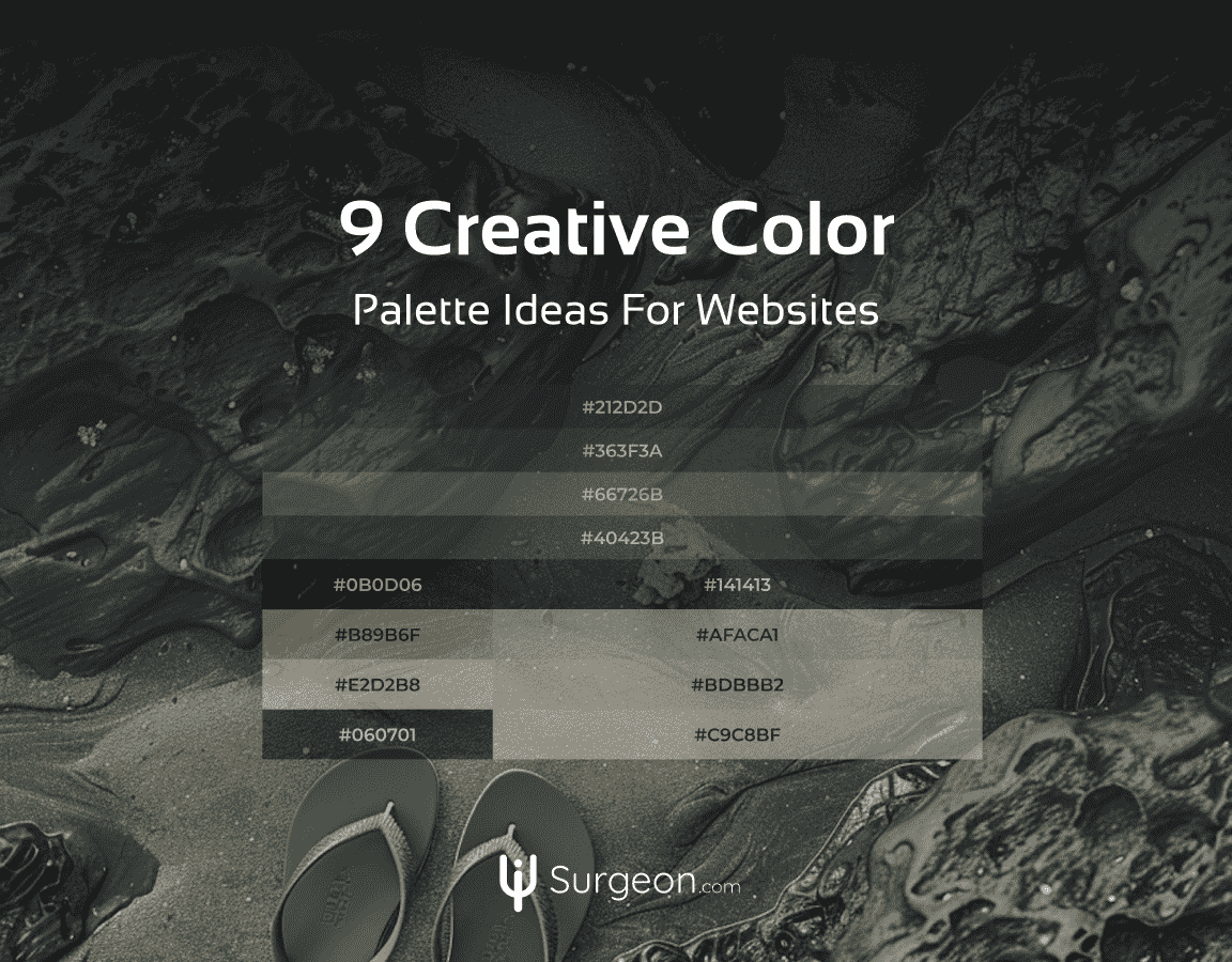
Ever stared at your portfolio website feeling overwhelmed by color choices? You're not alone! Choosing the right color scheme can feel like trying to solve a puzzle with too many pieces. Sometimes all the pieces look good, which makes choosing even harder.
But here's the good news: you don't need to be a color theory expert to create a stunning portfolio that catches attention.
In this guide, we'll explore 9 creative color schemes that work wonders for portfolio websites (free to use), plus exactly where to find inspiration for each one. Better yet? I'll show you how to choose and implement them without getting lost in complex design analysis.
If you haven't built your portfolio quite yet, consider learning about the 5 Best Places For Website Portfolio Templates As a Creative
Why Color Schemes Matter for Your Portfolio
Your portfolio has about 50 milliseconds to make a first impression. That's faster than you can say "color palette". Studies show that up to 90% of initial judgments about products are based on color alone. For your portfolio, this means color isn't just decoration...
Quick Color Psychology Tip: Colors trigger emotional responses in your visitors:
- Blue: Builds trust and conveys professionalism (perfect for business websites).
- Green: Promotes growth, health, and relaxation (great for wellness and eco-focused sites).
- White: Creates space and simplicity (ideal for portfolios or minimalist designs).
- Black: Signals luxury and sophistication (perfect for premium brands and high-end e-commerce).
- Yellow: Represents energy and positivity
- Red: Evokes passion and excitement
How to Choose Your Perfect Color Scheme
So you've chosen your perfect portfolio template out of these 11 free portfolio templates? Now it's time to choose your brand colors!
Before we dive into specific schemes, let's nail down how to pick the right one for YOU. It's simpler than you might think!
Ask yourself these three crucial questions:
- Who is your ideal client?
- What emotion should your work evoke?
- What's your personal brand personality?
Bro Tip: Not sure about your brand personality? Look at your 3 most successful projects. What colors do they have in common? There's often a pattern. For me it's just boring black.
You should also learn about the perfect background colors for websites!
Tools You'll Need (All Free!)
Let's set you up for success with some fantastic free tools:
Must-Have Color Tools:
- Coolors.co: For generating new color palettes.
- WebAIM Contrast Checker: To ensure readability.
- ColorZilla: For color picking.
- Adobe Color: To explore advanced schemes.
- HueMint: To experiment with combinations with real-life examples.
9 Stunning Portfolio Color Schemes
1. ReGrowth - Dark Green
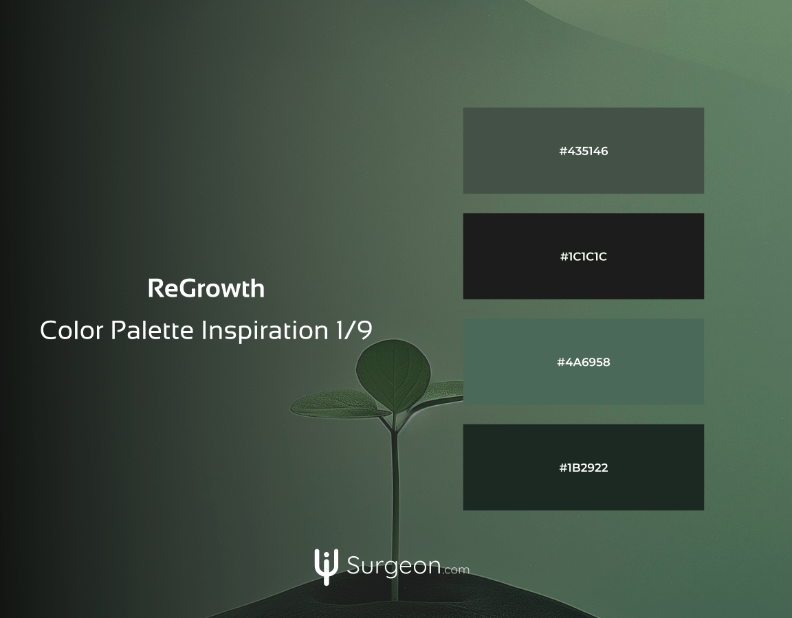
ReGrowth is a favorite of mine. As boring as it might look, it brings attention back to the content, making it a subtle choice for any minimalist creative.
You can use white as your background, and have any of these colors be your supplementary color to add a creative notch to your websites and designs.
Hex codes for this color palette:
- #435146
- #1C1C1C
- #4A6958
- #1B2922
2. Beach Stillness - Black Sand
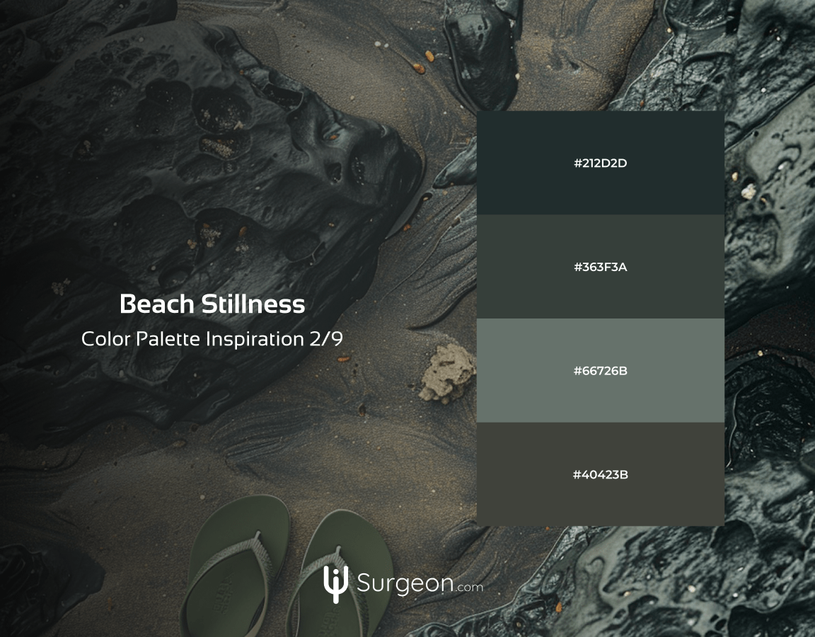
I was inspired by Iceland's black sand beaches when creating this one. It's very calm, features a very dark monotone green scheme. A color palette perfect for calm brands that have an audience and a product that doesn't need flashy marketing or branding.
Hex codes for this color palette:
- #212D2D
- #363F3A
- #66726B
- #40423B
3. Calm Down - Playful Scheme
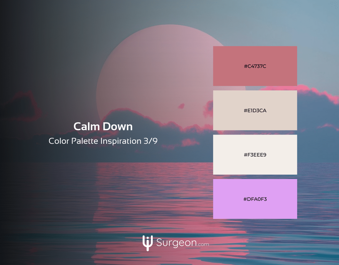
Calm Down features a playful pink scheme. Inspired by reddish sunrises, I tried to make it calming, yet interesting at the same time. The pink, light red and whites in this color palette makes it a great choice for personal brands and personal blogs and portfolios...
Hex codes for this color palette:
- #C4737C
- #E1D3CA
- #F3EEE9
- #DFA0F3
4. Subtle Elegance - Color Palette
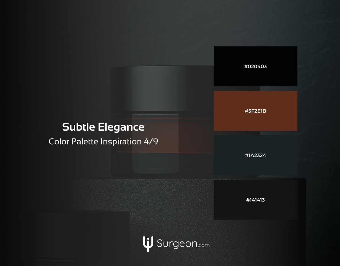
One of my favorites. Subtle Elegance uses a common branding pattern found in luxury products such as luxury watches or men's fashion products.
It's perfect for masculine and creative portfolios for a unique look if you want to stand out. I would highly recommend it only if you have imagery that can go well with it. If you're a photographer for example or a product designer.
Hex codes for this color palette:
- #020403
- #5F2E1B
- #1A2324
- #141413
5. Minimal Luxury - Best For Tech
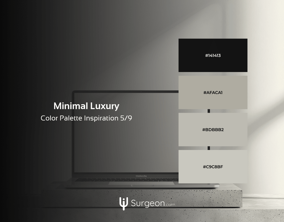
This is what I would personally go with!
Minimal Luxury is great for tech based portfolios and companies, it features a sleek, modern and minimalistic approach to colors, using only 2 colors with a monochromatic look.
Hex codes for this color palette:
- #141413
- #AFACA1
- #BDBBB2
- #C9C8BF
6. Subtle Difference - Luxurious Ecom
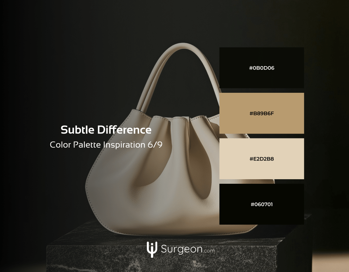
Subtle Difference is a color palette that is perfect for luxurious e-commerce businesses.
It's black, off-white and beige are perfect subtle colors for luxurious brands selling physical goods.
Hex codes for this color palette:
- #0B0D06
- #B89B6F
- #E2D288
- #060701
7. Inner Child - Welcoming Palette
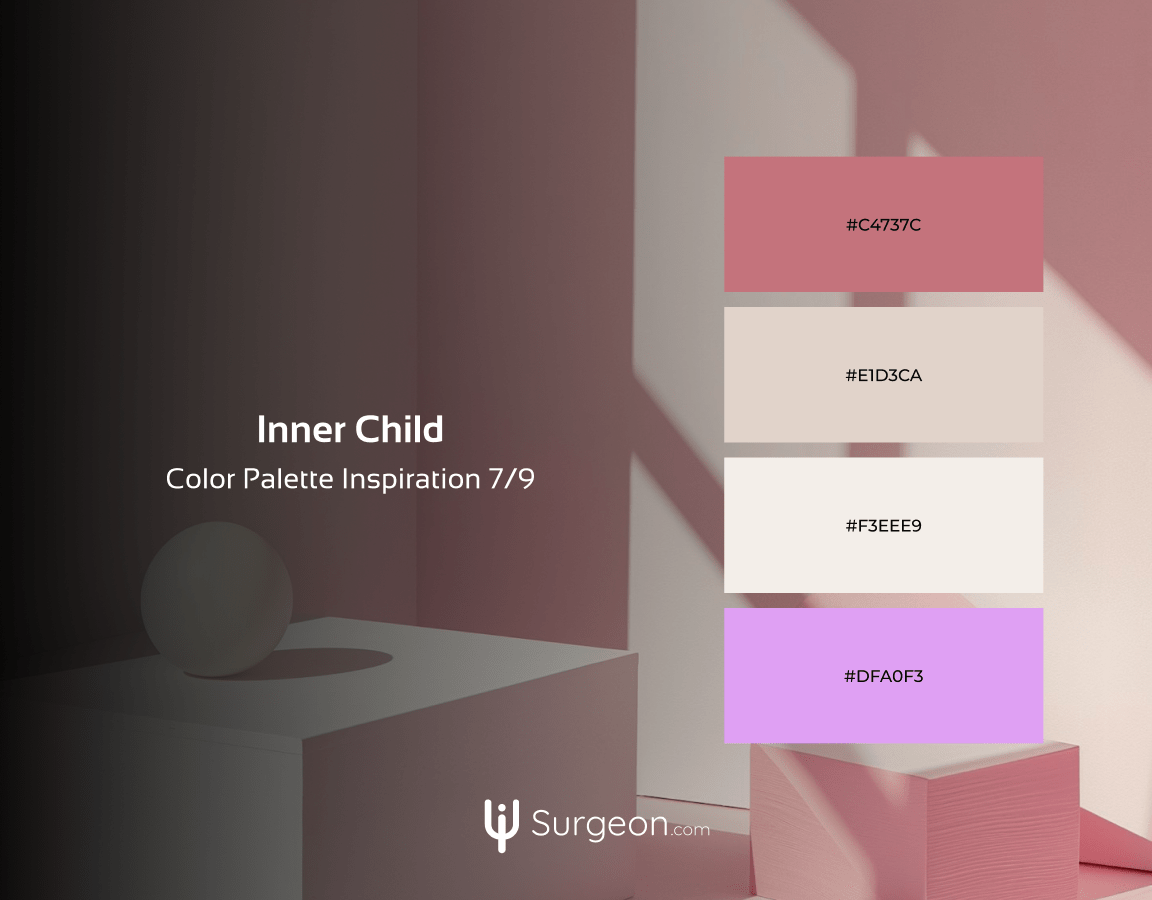
Inner Child is perfect for wellness brands and personal growth websites, it features a gentle, nurturing approach to colors, using soft pinks and lavenders that create an emotionally resonant palette.
Hex codes for this color palette:
- #C4737C
- #E1D3CA
- #F3EEE9
- #DFA0F3
8. Night Wander - Peaceful Designs
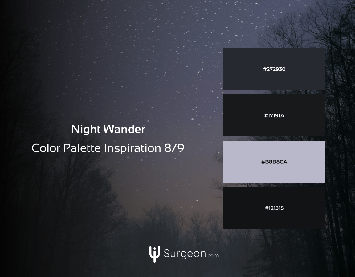
Night Wander is perfect for personal blogs and photography websites, it features a mysterious, trying-to-be deep approach to colors, using deep blacks and cool grays that mirror the beauty of a starlit sky.
Hex codes for this color palette:
- #272930
- #17191A
- #B8B8CA
- #121315
9. Sahara Elegance -
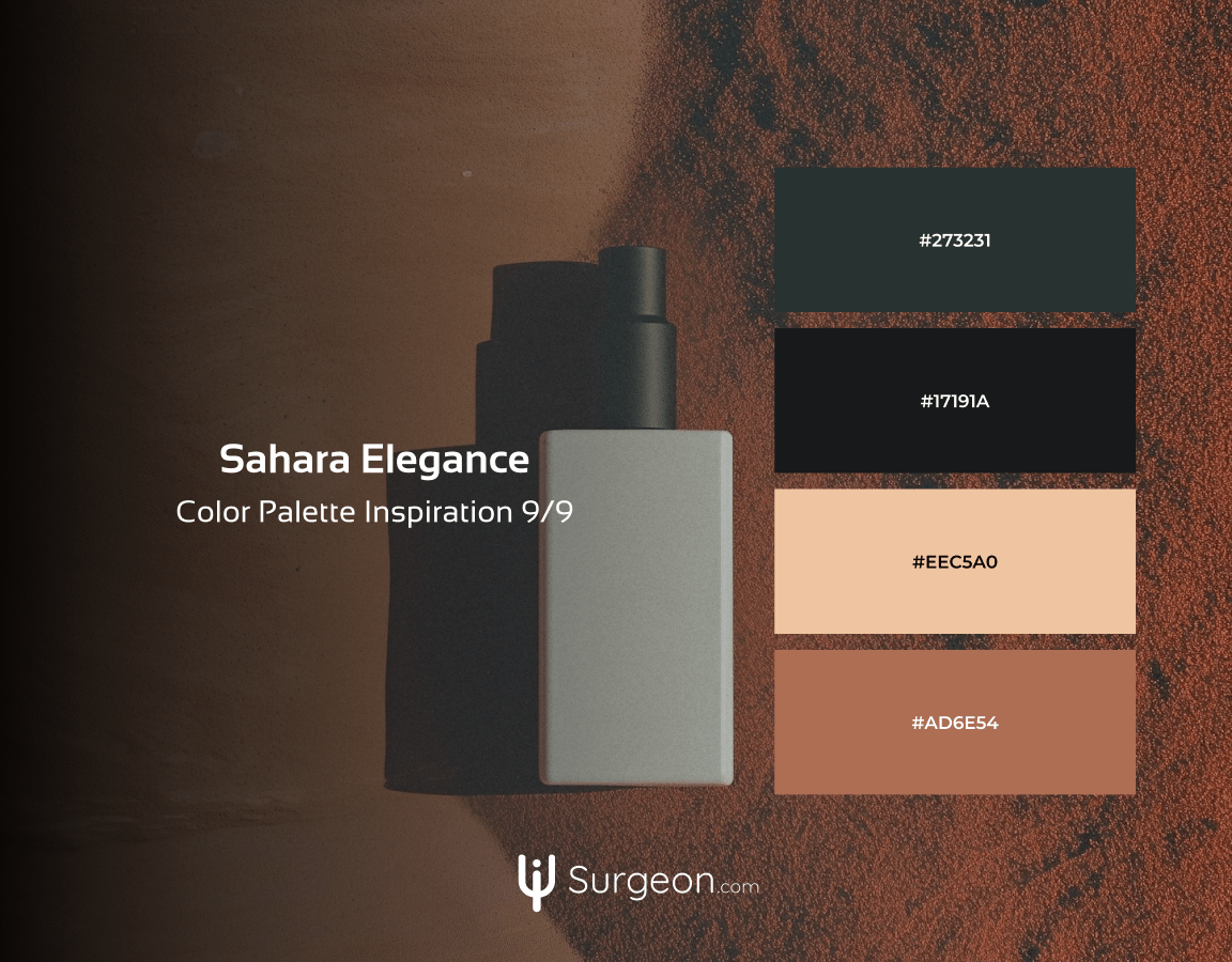
Sahara Elegance is ideal for high-end beauty and lifestyle brands, it features a refined, desert-inspired approach to colors, using rich earth tones and sophisticated neutrals that evoke luxury and warmth.
Hex codes for this color palette:
- #273231
- #17191A
- #EEC5A0
- #AD6E54
Common Color Scheme Mistakes to Avoid
Learn from others' mistakes instead of making them yourself!
Watch Out For:
- Using too many colors (stick to 3-4 max)
- Poor contrast making text hard to read
- Inconsistent color usage across pages
- Forgetting about accessibility
Quick Fix Tips:
- If something feels off, remove a color
- When in doubt, increase contrast
- Take screenshots to check consistency
- Use WebAIM's contrast checker
Next Step: Making Your Colors Work
You're almost ready to transform your portfolio! Here's your action plan:
- Choose one scheme from above that matches your style
- Visit the suggested inspiration sources
- Use the free tools to create your palette
- Test your colors using the implementation checklist
- Get feedback before launching
Remember: your portfolio's colors can evolve with your brand. Start simple, test with real users, and adjust based on feedback.
Resource Tip: Already feeling more confident about colors? Great! Take that momentum and check out these 11 FREE stunning portfolio templates you can start using today. a stunning portfolio website for more tips on making your work shine online.
Ready to show off your portfolio's new colors? Share your before-and-after on Pinterest - tag me so I can celebrate your transformation! And don't forget: the perfect color scheme isn't about following trends blindly - it's about finding what works for YOUR unique brand and goals.

