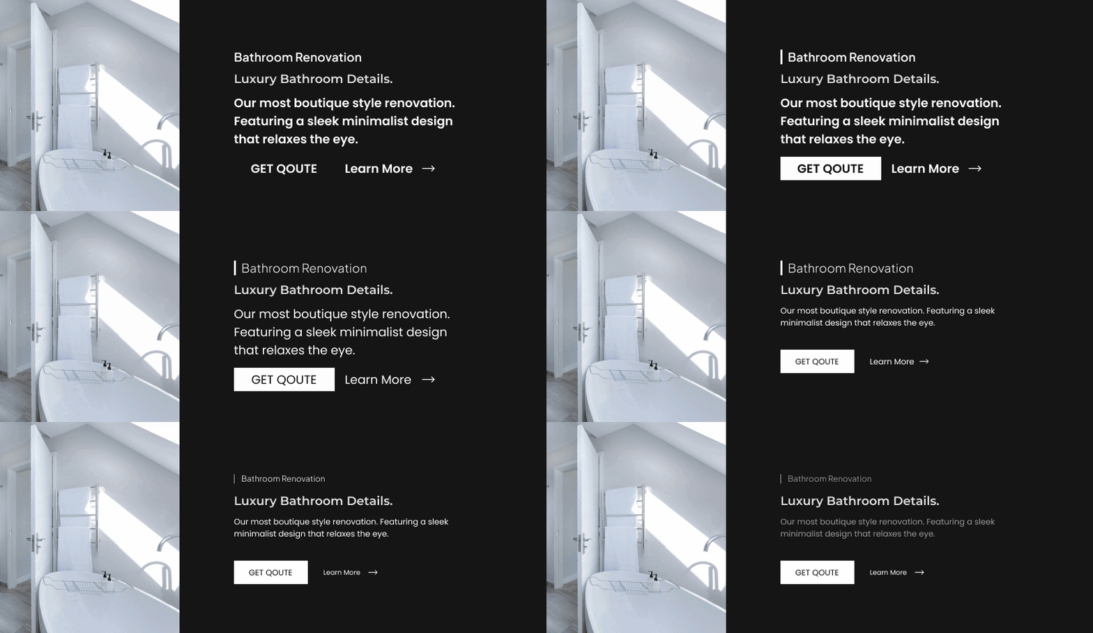
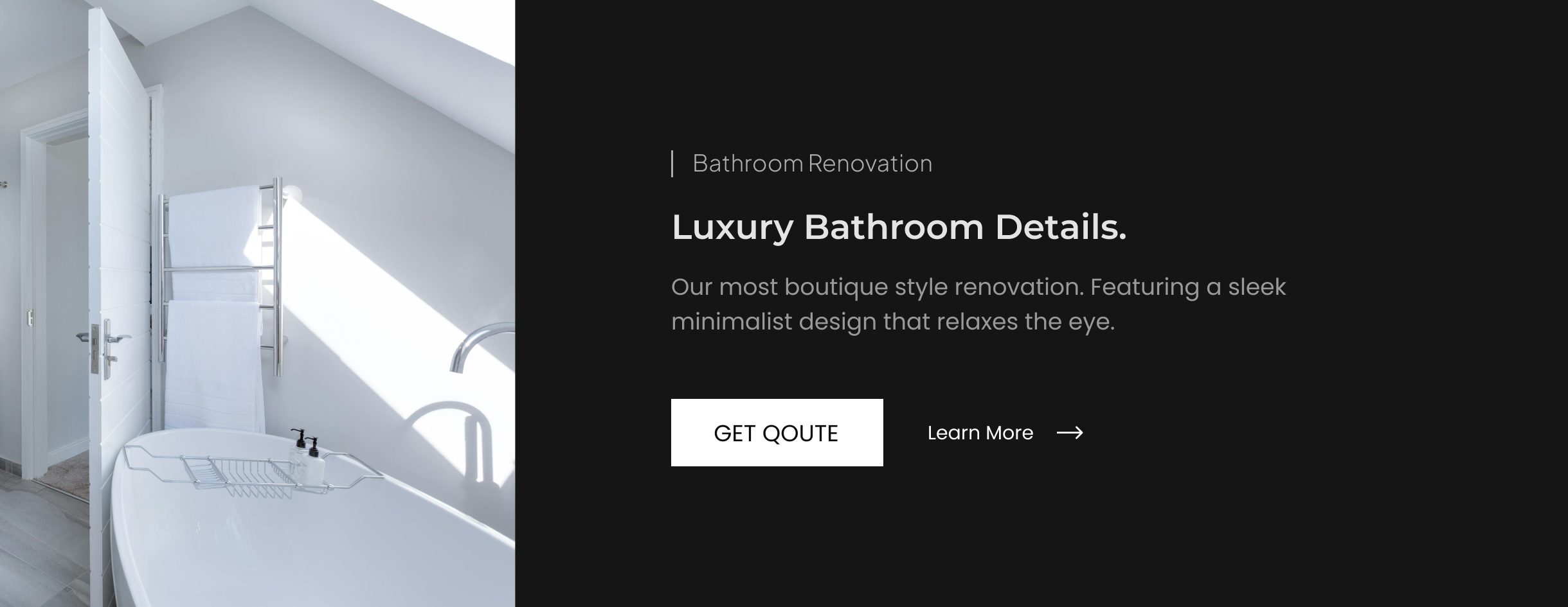
You’ve heard it before: “Hierarchy is important. It can make or break your website.” Everyone knows this. But knowing it isn’t enough.
Here’s the truth: if your website looks messy, unprofessional, or difficult to navigate, it’s probably because your hierarchy isn’t doing its job. The good news? Fixing it doesn’t require expensive tools, complex skills, or hours of work.
Today, I want to show you a concrete approach—a step-by-step guide to transform your entire design in just a few minutes, using nothing but this one powerful concept: hierarchy. Whether you're designing a blog, an e-commerce site, or even a landing page, these techniques will make your designs not only look better but also work better.
What Is Hierarchy? (And Why Does It Matter?)

Defining Hierarchy.
Hierarchy in design is the arrangement, sizing and placement of items based on it's importance and impact.
Think of it as the process of guiding users' attention to elements you think are important. And reducing attention to less important elements.
Why hierarchy is very important.
It is one of the most important design principles to master. Using it, alone, without colors or imagery or anything can make your website beautiful. And neglecting it, even if you have world-class imagery can make your design horrific.
Hierarchy and first impressions.
When a user first lands on your website, he doesn't know anything. He NEEDS to be directed. And it's you, the designer, who directs him and his attention to what's important.
If the user is confused and isn't aware of what the website is trying to do, he's probably leaving within 3 seconds on landing on the website.
The Core Principles of Hierarchy.
Hierarchy is just a fancy word for making things look important. And if you know how to do it right, it can completely change how people feel about your design. Here’s a breakdown of the key ideas behind hierarchy and how to nail each one.
- Focal Point: Decide what users should see first (headline, call-to-action).
- Size and Scale: Larger elements draw more attention than smaller ones.
- Color and Contrast: Use bold colors or high contrast to highlight key elements.
- Whitespace: Allow breathing room between elements to create clarity.
- Typography: Mix font sizes, weights, and styles for visual variety.
- Placement: people start left to right, top to bottom (in English).
1. Focal Point
What do you want people to see first? The focal point is like a flashing sign—it grabs attention instantly. Maybe it’s a bold headline or a shiny “Buy Now” button. The point is, without it, your design feels lost.
How to create a focal point:
- Use a color that pops—something bold.
- Make it big, but not obnoxiously big.
- Put it where people will naturally look first—center or up top.
Think of this: A restaurant website where the first thing you see is a picture of a drool-worthy burger, right above the “Order Now” button. That’s hierarchy doing its job.
2. Size and Scale
Bigger things scream, “Hey, look at me!” Smaller things? Not so much. That’s why size is such a game-changer. You can literally show people what matters most by just changing how big or small something is.
How to use size and scale:
- Headline = big. Body text = smaller. It’s that simple.
- Want people to click? Make the button bigger.
- Scale down less-important stuff like legal disclaimers (or remove it. Kidding).
Example: An event poster with the band name HUGE and the date and venue smaller below. No one’s coming to see “Tuesday, 8 PM.” They’re here for the band.
3. Color and Contrast
Color can be magic if you use it right. It makes important stuff pop and keeps everything else in the background. But if everything is bold and colorful, nothing stands out.
How to nail contrast:
- Light text on dark backgrounds. Dark text on light ones. Super simple.
- Use a single bold color to draw attention (hello, red button!).
- Don’t overdo it—one or two standout colors max.
Picture this: A donation website where the “Donate Now” button is bright orange, sitting on a calm blue background. Guess what people are clicking?
4. Whitespace
It’s not just empty space. It’s breathing room. Whitespace keeps your design from feeling like a crowded subway at rush hour.
How to use whitespace:
- Add space around text or buttons to make them stand out.
- Don’t cram everything together—let your elements breathe.
- Use it to separate sections so people don’t get lost.
Think about Apple’s website. Clean, simple, and all that space? It makes their products feel luxurious.
5. Typography
Fonts aren’t just about looking cool—they’re about telling a story. Big fonts say “Hey, this is important.” Smaller fonts? “Here’s the fine print.”
How to mix up typography:
- Headlines = big, bold, in-your-face.
- Body text = small, clean, and easy to read.
- Use italics or bold sparingly—too much, and it loses its impact.
Example: Think of a blog post. The title is bold and large, the subheadings are a bit smaller, and the body text is plain. It just makes sense.
6. Placement
This one’s easy: people read left to right, top to bottom (in English). Use that flow to guide them through your design.
How to use placement:
- Put the important stuff where eyes go first: top-left or center.
- Keep the flow logical—don’t make people hunt for buttons.
- Place CTAs (like “Sign Up” or “Buy Now”) in obvious spots—no one wants to scroll endlessly to find them.
Picture a homepage. Big, bold headline at the top, followed by a subheading, and then a centered button. That’s hierarchy in action.
A 5-Minute Hierarchy Fix (Practical Steps).
Hierarchy doesn’t need to be complicated or take hours to fix. Here’s a simple, no-fuss method to elevate your design fast:
- Start With Your Content
Before touching your design software, list everything the design needs to communicate. This keeps you focused and prevents wasted time moving things around without a plan.
Example: If it’s for a hotel, jot down: name, location, price, amenities, booking button, and any key selling points. - Rank the Importance of Each Element
Not everything is equal. Decide what the viewer needs to see first, second, and last.
Think: “If they only notice one thing, it should be the price or the booking button.” - Apply Visual Weight
Now, use tools like size, color, and spacing to make important elements stand out. Big text? Bold colors? Extra padding? These are your secret weapons.
Example: A bold headline for the hotel name, a large button for “Book Now,” and smaller text for the extras like Wi-Fi and breakfast.
You may also use opacity to reduce some elements. - Refine the Layout
Organize everything into grids or sections to make it easy to follow.
Tip: Try aligning elements to the left or center to keep things neat. - Test for Clarity
Take a step back (literally). Look at your design from a distance or ask someone for a quick glance. Can they tell what it’s about in 5 seconds? If not, tweak it.
Real-Life Examples of Hierarchy in Action
1. Before and After Comparison


2. Successful Sites
Ever wonder why sites like Airbnb or Apple just feel professional? It’s all hierarchy. Airbnb highlights their search bar and stunning imagery first, while Apple leads with a massive product image and a single bold headline.
3. A Practical Exercise
Take a design you’ve worked on (or grab a random template). Rework it using the steps above. Focus on size, alignment, and spacing to create a clear focal point.
Share the before-and-after with me on Instagram so I can share it! (If it's okay)
Common Mistakes to Avoid
Even great designers fall into these traps:
- Overloading the Viewer
If everything is bold and flashy, nothing stands out. Prioritize, or your design becomes visual noise. - Neglecting Whitespace
Crowding elements makes your design feel suffocating. Whitespace isn’t wasted—it’s clarity. - Inconsistent Alignment
Misaligned elements scream unprofessional. Stick to a grid, and you’ll instantly elevate your design. - Low Contrast
If your text and background are too similar, no one’s reading it. Contrast is your best friend.
Conclusion:
Truth is: mastering hierarchy isn’t just about better designs—it’s about creating designs that work.
- Hierarchy improves usability. When users instantly know where to click or what to read, they’ll trust your design more.
- It boosts aesthetics. Even simple designs look professional with clear hierarchy.
- It builds confidence. The more you practice, the faster and better you’ll get at spotting and fixing weak designs.
Start with small projects, like Instagram posts or portfolio pieces. Once you get the hang of it, apply it to larger projects like websites or client work. Even the pros keep hierarchy top of mind—it’s that important.


